Title here
Summary here
Module 7 taught Docent – our assistant for the Meridian serverless database docs – to leave a trail: a structured log line, a trace, and a costed, timed record for every request it serves. That trail answers what happened. This module asks a harder, never-finished question: is Docent still good right now? Evaluation is a snapshot you take before you ship; monitoring is the live feed you watch after. A prompt tweak silently breaks a third of answers, a retrieval index goes stale, a model upgrade shifts tone – and none of it shows up in the eval you ran last week. It shows up in production, in the metrics streaming past your dashboard, if you’re watching the right ones.
The trap is watching the wrong ones, or watching them the wrong way. A wall of forty charts is not monitoring; it’s noise an on-call engineer scrolls past at 3am. Averaging a metric over Docent’s whole lifetime is not monitoring either – it buries a regression that started ten minutes ago under three weeks of healthy history. Real monitoring is a handful of metrics that users actually feel, computed over a rolling window so fresh trouble is visible, with alerts that page a human when a line crosses a threshold. This lesson builds exactly that: a deterministic stream of per-minute Docent metrics with a deliberate incident buried in it, and an alert engine that catches the incident and tells you when.
In this lesson, you will:
You cannot watch everything, so watch the things that either hurt users directly or predict that users are about to get hurt. For an LLM app like Docent, that shortlist is:
Refusal rate is a two-sided metric
Watch refusal rate for movement in either direction, and interpret it against Docent’s job. A refusal rate that suddenly rises usually means retrieval broke – Docent is declining questions it should be able to answer because it isn’t getting the context. A refusal rate that suddenly falls toward zero can be worse: it may mean a prompt change stopped Docent from refusing out-of-scope questions, so it’s now confidently answering things the Meridian docs never covered (the exact hallucination failure the whole course is built to prevent). The healthy state is a stable, modest refusal rate, which is why we alert on a sharp change from baseline, not on the raw value alone.
Sort every metric into one of two buckets, because they play different roles in an incident:
You need both. Leading signals are what page the on-call engineer now; lagging signals are what you review in the post-incident writeup and what feed the drift detection in the next lesson. The whole point of a dashboard is to put your best leading signals where a human sees them move.
Rather than run thousands of live calls, we’ll simulate a realistic per-minute stream – the shape of what a real metrics pipeline would emit, but deterministic so the whole lesson reproduces exactly. Fifteen minutes of Docent traffic, one row per minute, with five metrics each. The data is clearly synthetic but modeled on the real Docent numbers from Module 7 (p95 around 1.6s, refusal rate around 5-6%, cost around 1.4 cents per minute). Buried in it is a deliberate incident: at 09:07 retrieval starts failing, so refusal_rate and p95_latency_s spike together and stay elevated for three minutes before recovering.
# Block 1: the synthetic per-minute metrics stream for Docent
STREAM = [
    #  minute, requests, error_rate, p95_latency_s, refusal_rate, cost_usd
    {"minute": "09:00", "requests": 52, "error_rate": 0.010, "p95_latency_s": 1.62, "refusal_rate": 0.058, "cost_usd": 0.0141},
    {"minute": "09:01", "requests": 48, "error_rate": 0.008, "p95_latency_s": 1.55, "refusal_rate": 0.052, "cost_usd": 0.0129},
    {"minute": "09:02", "requests": 55, "error_rate": 0.011, "p95_latency_s": 1.71, "refusal_rate": 0.061, "cost_usd": 0.0148},
    {"minute": "09:03", "requests": 50, "error_rate": 0.009, "p95_latency_s": 1.60, "refusal_rate": 0.055, "cost_usd": 0.0135},
    {"minute": "09:04", "requests": 53, "error_rate": 0.010, "p95_latency_s": 1.66, "refusal_rate": 0.049, "cost_usd": 0.0143},
    {"minute": "09:05", "requests": 47, "error_rate": 0.012, "p95_latency_s": 1.58, "refusal_rate": 0.060, "cost_usd": 0.0127},
    {"minute": "09:06", "requests": 51, "error_rate": 0.009, "p95_latency_s": 1.63, "refusal_rate": 0.054, "cost_usd": 0.0138},
    {"minute": "09:07", "requests": 49, "error_rate": 0.011, "p95_latency_s": 4.42, "refusal_rate": 0.318, "cost_usd": 0.0132},  # incident starts
    {"minute": "09:08", "requests": 46, "error_rate": 0.041, "p95_latency_s": 4.88, "refusal_rate": 0.401, "cost_usd": 0.0124},  # incident peak
    {"minute": "09:09", "requests": 44, "error_rate": 0.038, "p95_latency_s": 3.71, "refusal_rate": 0.352, "cost_usd": 0.0119},  # still elevated
    {"minute": "09:10", "requests": 50, "error_rate": 0.013, "p95_latency_s": 1.94, "refusal_rate": 0.121, "cost_usd": 0.0135},  # recovering
    {"minute": "09:11", "requests": 52, "error_rate": 0.010, "p95_latency_s": 1.68, "refusal_rate": 0.057, "cost_usd": 0.0141},  # back to baseline
    {"minute": "09:12", "requests": 48, "error_rate": 0.009, "p95_latency_s": 1.61, "refusal_rate": 0.051, "cost_usd": 0.0129},
    {"minute": "09:13", "requests": 54, "error_rate": 0.011, "p95_latency_s": 1.69, "refusal_rate": 0.059, "cost_usd": 0.0146},
    {"minute": "09:14", "requests": 51, "error_rate": 0.010, "p95_latency_s": 1.64, "refusal_rate": 0.053, "cost_usd": 0.0138},
]

print(f"{'minute':>6} {'req':>4} {'err':>6} {'p95_s':>6} {'refuse':>7} {'cost':>7}")
for m in STREAM:
    print(f"{m['minute']:>6} {m['requests']:>4} {m['error_rate']:>6.3f} "
          f"{m['p95_latency_s']:>6.2f} {m['refusal_rate']:>7.3f} {m['cost_usd']:>7.4f}")
minute req err p95_s refuse cost
09:00 52 0.010 1.62 0.058 0.0141
09:01 48 0.008 1.55 0.052 0.0129
09:02 55 0.011 1.71 0.061 0.0148
09:03 50 0.009 1.60 0.055 0.0135
09:04 53 0.010 1.66 0.049 0.0143
09:05 47 0.012 1.58 0.060 0.0127
09:06 51 0.009 1.63 0.054 0.0138
09:07 49 0.011 4.42 0.318 0.0132
09:08 46 0.041 4.88 0.401 0.0124
09:09 44 0.038 3.71 0.352 0.0119
09:10 50 0.013 1.94 0.121 0.0135
09:11 52 0.010 1.68 0.057 0.0141
09:12 48 0.009 1.61 0.051 0.0129
09:13 54 0.011 1.69 0.059 0.0146
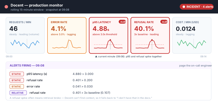
09:14 51 0.010 1.64 0.053 0.0138Read the incident by eye. From 09:00 to 09:06 everything is boring: refusal rate hovers near 0.055, p95 near 1.6s – boring is exactly what healthy monitoring looks like. Then at 09:07 refusal_rate jumps to 0.318 and p95_latency_s to 4.42s in the same minute; 09:08 is the peak (0.401 refusal, 4.88s p95, and error rate now elevated at 0.041); by 09:10 it’s recovering and by 09:11 it’s back to baseline. Notice that requests and cost barely move through all of this – volume and spend are steady, so an engineer watching only the “business” metrics would miss the whole event. The signals that scream are the leading ones: refusals and latency.
Here’s the mistake that makes a dashboard useless: reporting each metric as an average over all history. The longer Docent runs, the more healthy minutes pile up, and the more any single bad minute gets diluted. A fresh regression – the thing you most need to see – becomes invisible under the weight of the past.
The fix is a rolling window: at each minute, summarize only the last N minutes, so old healthy history ages out and recent trouble dominates. Watch what happens to the refusal rate when we compute it two ways – a 3-minute rolling mean vs the lifetime average since 09:00:
# Block 2: rolling window vs lifetime average for refusal_rate
refusals = [m["refusal_rate"] for m in STREAM]

def rolling_mean(values, end_idx, window):
    prior = values[max(0, end_idx - window):end_idx + 1]   # inclusive of current
    return sum(prior) / len(prior)

print(f"{'minute':>6} {'refusal':>8} {'roll_3m':>8} {'lifetime':>9}")
for i, m in enumerate(STREAM):
    roll = rolling_mean(refusals, i, 2)          # current + 2 prior = 3-minute window
    lifetime = sum(refusals[:i + 1]) / (i + 1)   # average since minute 0
    flag = "  <-- incident" if m["refusal_rate"] > 0.20 else ""
    print(f"{m['minute']:>6} {m['refusal_rate']:>8.3f} {roll:>8.3f} {lifetime:>9.3f}{flag}")
minute refusal roll_3m lifetime
09:00 0.058 0.058 0.058
09:01 0.052 0.055 0.055
09:02 0.061 0.057 0.057
09:03 0.055 0.056 0.056
09:04 0.049 0.055 0.055
09:05 0.060 0.055 0.056
09:06 0.054 0.054 0.056
09:07 0.318 0.144 0.088 <-- incident
09:08 0.401 0.258 0.123 <-- incident
09:09 0.352 0.357 0.146 <-- incident
09:10 0.121 0.291 0.144
09:11 0.057 0.177 0.136
09:12 0.051 0.076 0.130
09:13 0.059 0.056 0.125
09:14 0.053 0.054 0.120Compare the two right-hand columns at the peak. At 09:09 the rolling 3-minute mean is 0.357 – it has climbed right up with the incident and is screaming. The lifetime average is only 0.146 for the same minute: seven healthy minutes are still dragging it down, so it looks like a mild bump. Worse, look at the recovery: by 09:14 the rolling mean is back to 0.054 (it correctly reports “we’re healthy again”), while the lifetime average is still stuck at 0.120 and will stay elevated for a long time, falsely implying an ongoing problem. The lifetime average is wrong in both directions – too quiet during the incident, too loud after it. This block is pure arithmetic over a fixed list, so it prints identical numbers every run; a rolling window is a deterministic, trustworthy view, and it’s the one your dashboard should show.
A dashboard is the small set of charts an on-call engineer actually watches – one sparkline per metric on the shortlist above, each over a rolling window, arranged so a spike is obvious at a glance. The figure below mocks Docent’s dashboard captured at 09:08, mid-incident: five metric tiles, each with its 15-minute sparkline, and the two that broke (p95 latency and refusal rate) rendered in red with an ALERT badge and a dashed threshold line.
An alert is a rule that turns a chart nobody is looking at into a page that wakes someone up. Two things make an alert good. First, it fires on a symptom users feel – latency, errors, refusals, a cost blowup – not on an internal metric they don’t. Second, its threshold is tuned to the real trade-off between two failure modes: set it too tight and you get alert fatigue (a pager that cries wolf every hour until the on-call engineer mutes it and misses the real fire); set it too loose and you get missed incidents (the threshold never trips and users suffer in silence). There is no perfect setting – there’s a dial between noisy and blind, and you tune it per metric.
There are two ways to write the threshold itself:
p95_latency_s > 3.0, error_rate > 0.03. Simple, predictable, and right for metrics with a physically meaningful limit (an SLA of “p95 under 3 seconds” is a static threshold). The weakness: a static line can’t know what “normal” is for a metric whose healthy value drifts over time.Good monitoring uses both, and we’ll implement both now.
The engine walks the stream one minute at a time – exactly as a real one would consume a live feed – and checks each metric against its rules. Static rules are a simple threshold table. The relative rule computes a rolling baseline from prior minutes only (never including the current minute, or a spike would inflate its own baseline and hide itself) and fires when the current value exceeds a multiple of it.
# Block 3: static + relative alert engine over the stream
STATIC_RULES = {
    # metric        : (threshold, comparison, human label)
    "error_rate":    (0.030, "above", "error rate"),
    "p95_latency_s": (3.00,  "above", "p95 latency (s)"),
    "refusal_rate":  (0.200, "above", "refusal rate"),
    "cost_usd":      (0.020, "above", "cost/min (USD)"),
}

WINDOW = 5            # rolling baseline = mean of the previous WINDOW minutes
REL_METRIC = "refusal_rate"
REL_MULTIPLIER = 3.0  # fire if current > REL_MULTIPLIER x rolling baseline

def rolling_baseline(values, end_idx, window):
    """Mean of up to `window` values ending just BEFORE end_idx -- the baseline
    is built from history only, never from the current minute."""
    prior = values[max(0, end_idx - window):end_idx]
    if not prior:
        return None
    return sum(prior) / len(prior)

def scan(stream):
    alerts = []
    refusals = [m["refusal_rate"] for m in stream]
    for i, m in enumerate(stream):
        ts = m["minute"]
        for metric, (thresh, _cmp, label) in STATIC_RULES.items():   # static checks
            if m[metric] > thresh:
                alerts.append((ts, "STATIC", label, f"{m[metric]:.3f} > {thresh:.3f}"))
        base = rolling_baseline(refusals, i, WINDOW)                  # relative check
        if base is not None and base > 0 and m[REL_METRIC] > REL_MULTIPLIER * base:
            alerts.append((ts, "RELATIVE", "refusal rate",
                           f"{m[REL_METRIC]:.3f} > {REL_MULTIPLIER:.0f}x baseline ({base:.3f})"))
    return alerts

fired = scan(STREAM)
print(f"Fired {len(fired)} alert(s):\n")
print(f"{'time':>6}  {'kind':<8}  {'metric':<16}  detail")
print("-" * 64)
for ts, kind, metric, detail in fired:
    print(f"{ts:>6}  {kind:<8}  {metric:<16}  {detail}")
Fired 10 alert(s):
time kind metric detail
----------------------------------------------------------------
09:07 STATIC p95 latency (s) 4.420 > 3.000
09:07 STATIC refusal rate 0.318 > 0.200
09:07 RELATIVE refusal rate 0.318 > 3x baseline (0.056)
09:08 STATIC error rate 0.041 > 0.030
09:08 STATIC p95 latency (s) 4.880 > 3.000
09:08 STATIC refusal rate 0.401 > 0.200
09:08 RELATIVE refusal rate 0.401 > 3x baseline (0.107)
09:09 STATIC error rate 0.038 > 0.030
09:09 STATIC p95 latency (s) 3.710 > 3.000
09:09 STATIC refusal rate 0.352 > 0.200The engine caught the incident on the exact minute it began. At 09:07 – the first bad minute – three alerts fire together: the static p95 alert (4.420 > 3.000), the static refusal alert (0.318 > 0.200), and the relative refusal alert, which is the sharpest of all because the baseline was still clean (0.056) and 0.318 is nearly six times it. The engine keeps paging through 09:08 (adding the error-rate alert as errors climb) and 09:09, then goes quiet from 09:10 as the metrics recover – no alerts on the healthy tail, which is exactly what you want.
One detail rewards a close look: the relative alert stops firing after 09:08, even though 09:09 is still a bad minute (0.352). Why? By 09:09 the rolling baseline window has swallowed the spike itself – it now averages minutes 09:04-09:08, which include the 0.318 and 0.401 peaks, dragging the baseline up to 0.176, so 0.352 no longer clears 3x. This is a real and important property: a relative alert can blind itself once an incident enters its own baseline window. It’s brilliant at catching the start of a change and poor at recognizing a sustained new level – which is precisely why you pair it with static thresholds (which keep firing at 09:09 because 0.352 is still absolutely too high) and, in the next lesson, with drift detection. The engine does only deterministic arithmetic over the fixed stream, so re-running it prints the identical ten alerts every time – an alert rule you can trust to behave the same in a test as it does at 3am.
Alert on the smallest set of symptoms that covers the incident
Notice we did not write an alert on requests or cost_usd for this incident – they never moved, so a rule on them would have added noise without adding coverage. The discipline is: alert on the fewest metrics that still catch the failures you care about, and make sure each one is a symptom a user feels. Latency, errors, and refusals cover this retrieval incident completely; a cost alert earns its place for a different failure (a prompt bug that balloons token usage), not this one. Every extra alert is a small tax on the on-call engineer’s attention, so make each rule pay for itself.
The engine watches cost_usd with a static threshold of 0.020 dollars per minute, but the incident never tripped it – cost stayed near 0.013 throughout. Prove the rule would catch a cost blowup by adding one synthetic minute, {"minute": "09:15", "requests": 90, "error_rate": 0.010, "p95_latency_s": 1.70, "refusal_rate": 0.055, "cost_usd": 0.0263}, to a copy of the stream (simulating a prompt bug that doubled the retrieved context), re-run scan, and confirm exactly one new STATIC cost/min (USD) alert fires at 09:15. Why is cost a lagging signal for this kind of bug even though the alert fires quickly?
Hint
Append the new dict to STREAM + [extra] and pass that to scan. The cost rule fires because 0.0263 > 0.020; nothing else trips (latency and refusals are back to normal in that minute). Cost is lagging here because by the time the per-minute cost has visibly doubled, the bad prompt has already been serving expensive requests for a full minute – the money is already spent. A leading signal for the same bug would be input-token count per request from Module 7, which jumps on the very first bad request, before a whole minute of spend accumulates.
Add a sixth metric, json_valid_rate (the fraction of a sampled batch of responses that parsed as valid JSON when Docent is asked for structured output), to each row. Give it a healthy baseline near 0.99 for most minutes but drop it to 0.62 at 09:08 to simulate a prompt regression that broke the output format. Then add a static rule that fires when json_valid_rate falls below 0.90 (note: this alert fires on a value going down, not up) and confirm it pages at 09:08. Why is a validity-rate alert a better leading quality signal than a sampled judge score?
Hint
Your static-rule table assumes “above”; for this metric you need a “below” comparison, so either add a direction flag to each rule tuple or write a small separate check: if m["json_valid_rate"] < 0.90: alerts.append(...). It fires only at 09:08 (0.62 < 0.90). Validity rate leads a sampled judge score because it’s computed on every request cheaply and deterministically (a JSON parse either succeeds or fails), so a formatting regression shows up instantly and at full volume; a judge score is sampled (say 1 in 100) and costs a model call, so it reacts more slowly and noisily. Cheap deterministic proxies are the front line; the judge is the confirmation.
The relative refusal rule uses REL_MULTIPLIER = 3.0. Re-run scan with the multiplier set to 1.5, then to 6.0, and count how many relative alerts fire at each setting on the same stream. Explain, in terms of the noisy-vs-missed trade-off, what each extreme does – and why there’s no single “correct” multiplier independent of how much a false page costs your team.
Hint
Make REL_MULTIPLIER a parameter of scan (or a loop variable) and print the relative-alert count for each value. At 1.5 the rule is twitchy – it fires on both incident minutes and risks firing on ordinary minute-to-minute wobble in the baseline, trending toward alert fatigue. At 6.0 it’s so conservative that even the 09:07 spike (0.318 vs a 0.056 baseline, a 5.7x jump) barely clears it and the 09:08 relative alert against the already-inflated 0.107 baseline no longer fires – trending toward missed incidents. The right multiplier depends on your cost of a false page (does it wake a human, or just log?) versus your cost of a missed minute – a business decision the math can’t make for you, which is exactly why alert thresholds are tuned, reviewed, and owned, not set once and forgotten.
Monitoring is the never-finished counterpart to evaluation: evaluation asks “was Docent good when we shipped?” and monitoring asks “is it good right now?” You learned the shortlist of metrics worth watching continuously for an LLM app – volume, latency percentiles, cost per unit time, error rate, refusal rate, and cheap online quality proxies like structured-output validity and sampled judge scores – and why a sudden refusal spike is one of the strongest leading signals an app like Docent has, because it usually means retrieval broke and left the model with no context to answer from. You sorted signals into leading (predict trouble: refusals, latency) and lagging (confirm it: daily cost, thumbs-down totals), and saw that a good dashboard puts your best leading signals where a human sees them move. You built a deterministic 15-minute metrics stream with a deliberate retrieval incident at 09:07, proved that a rolling window exposes the regression (rolling refusal mean hit 0.357 at the peak) that a lifetime average hides (still only 0.146, and wrongly stuck at 0.120 long after recovery), and wrote an alert engine with static thresholds and a relative-to-baseline rule. It fired ten alerts across 09:07-09:09, caught the incident on the first bad minute, stayed silent on the healthy tail, and reproduced byte-for-byte on re-run – while teaching one subtle real-world lesson: a relative alert can blind itself once the spike enters its own baseline window, which is exactly why you pair it with static thresholds.
Every technique in this course up to now runs before or beside production – eval sets, judges, RAG and agent scoring, the observability capture layer. Monitoring is where all of it either pays off in production or doesn’t, because it’s the only layer that tells you a problem is happening while it’s happening. The instinct to build a giant dashboard and average everything over all time is the single most common way teams make monitoring useless: the important chart is buried among forty unimportant ones, and the one metric that matters is diluted by weeks of healthy history until a real regression looks like a rounding error. The discipline in this lesson – a handful of user-felt metrics, a rolling window, and a small set of well-tuned static and relative alerts on symptoms – is what turns “we found out from an angry customer” into “we got paged ninety seconds after retrieval broke.” The refusal-rate spike you learned to alert on is the canonical LLM-app early warning, and the relative-alert blind spot you discovered is exactly the gap that motivates the next lesson: some regressions don’t spike, they drift – slowly, under your baseline’s nose – and catching those needs a different tool.
You can now stand up continuous monitoring for an LLM app, not just evaluate it once. You learned the short list of metrics worth watching in real time – volume, latency percentiles, cost, error rate, refusal rate, and cheap online quality proxies – and why a refusal-rate spike is a leading signal that retrieval has broken and left Docent answering blind. You separated leading signals that page you now from lagging ones that confirm the damage later, built a deterministic per-minute metrics stream with a deliberate incident at 09:07, and proved that a rolling window makes that incident visible (a rolling refusal mean of 0.357 at the peak) where a lifetime average hides it (a limp 0.146). Then you wrote an alert engine that fires both static and relative-to-baseline alerts, caught the incident on its first minute with ten timestamped alerts, stayed quiet on the healthy tail, and reproduced exactly on re-run – while surfacing the real-world subtlety that a relative alert can blind itself once the spike contaminates its own baseline. That blind spot is the bridge to Lesson 2: monitoring and alerts catch the fast, sharp incidents, but the slow, quiet ones – a model that degrades a little each week, inputs that drift away from your test set – slide right under a threshold. Detecting those is drift and regression detection, and it’s where you’re headed next.
Keep DATATWEETS free. Help fund practical data, AI, and engineering lessons for learners worldwide.