Title here
Summary here
A hands-on chart makeover: take one default matplotlib bar chart and rebuild it step by step, cutting chart junk, choosing a deliberate color palette, trying plt.style.use(), adding direct annotations, and saving it at a real publication DPI.

You’ve already made the chart — ax.bar(...) ran, something showed up, and it technically answers your question. But it looks like every other default matplotlib chart anyone has ever posted to Stack Overflow: a flat blue-ish color that means nothing, a box drawn around data that didn’t ask for one, and a title that doesn’t exist. If you’re still deciding which library to reach for in the first place, our guide to matplotlib, seaborn, pandas, and plotly covers that decision — start there. This post assumes you’ve already picked one and asks a narrower question: how do you take the chart you already have and make it look like you meant it?
This is where solid analysis quietly undersells itself — the numbers are right, but the chart looks like a debugging print statement, so nobody trusts it as much as they should. The fix isn’t a plugin or a “beautiful chart” library. It’s a short, repeatable set of habits: cut what isn’t earning its place, choose color on purpose, and label the one thing you want the reader to notice. We’ll build all of it on one real chart, end to end.
Before touching any code, it helps to have one test you can run on any element of a chart: does this pixel tell the reader something they need, or is it just there because a default put it there?
A bar’s height carries information. A color assigned deliberately to a category carries information. A title that states the actual finding carries information. But a box drawn around the data on all four sides usually doesn’t — the reader already knows where the plot area ends. A grid line for every tick usually doesn’t, unless someone needs to read off precise values. A legend repeating a label already sitting next to the bar it describes doesn’t either. Call all of that chart junk: pixels spent without paying the reader back in meaning.
The process, in three steps:
That’s the whole method. Everything below is one dataset run through those three steps.
We’ll use penguins, a small, real dataset of body measurements for three penguin species, collected at three islands near Palmer Station, Antarctica, and bundled directly with seaborn — no download, no API key.
import matplotlib
matplotlib.use("Agg")  # headless backend — see the gotchas section below
import matplotlib.pyplot as plt
import seaborn as sns

penguins = sns.load_dataset("penguins")
penguins[["species", "island", "body_mass_g"]].head()
species island body_mass_g
0 Adelie Torgersen 3750.0
1 Adelie Torgersen 3800.0
2 Adelie Torgersen 3250.0
3 Adelie Torgersen NaN
4 Adelie Torgersen 3450.0Data: the Palmer Penguins dataset (Gorman, Williams & Fraser, 2014, via the Palmer Station Antarctica LTER, CC0), bundled with seaborn (seaborn.load_dataset). 344 rows, three species — Adelie, Chinstrap, and Gentoo — with a handful of genuine missing measurements (body_mass_g is NaN for 2 rows), which groupby quietly drops on its own. Say you’re putting together a one-chart summary for a conservation newsletter: how much heavier is a Gentoo penguin than the other two species, on average?
means = penguins.groupby("species", observed=True)["body_mass_g"].mean().round(1)
means
species
Adelie 3700.7
Chinstrap 3733.1
Gentoo 5076.0
Name: body_mass_g, dtype: float64(The outputs in this post come from matplotlib 3.11, seaborn 0.13.2, and pandas 3.0.3 — everything shown also works on the current matplotlib 3.x / seaborn 0.13.x line.) That means Series — three numbers — is the entire dataset this post’s chart needs. Everything from here is about how honestly it gets drawn.
Here’s a very ordinary first pass — group, bar-plot, and reflexively call ax.grid(True) because someone once told you grids “help readability”:
fig, ax = plt.subplots(figsize=(6, 4))
ax.bar(means.index, means.values)
ax.set_xlabel("species")
ax.set_ylabel("body_mass_g")
ax.grid(True)

len(ax.patches), {s: ax.spines[s].get_visible() for s in ax.spines}, ax.get_ygridlines()[0].get_visible()
(3, {'left': True, 'right': True, 'bottom': True, 'top': True}, True)This post’s verification script runs headlessly, so rather than describe a screenshot, the chart’s real state confirms the problem directly: all four spines are visible, gridlines are on, and there’s no title — ax.get_title() returns ''. Every bar is the exact same flat blue, (0.122, 0.467, 0.706), matplotlib’s default tab:blue, chosen because it’s first in the color cycle, not because it means “Adelie” or “Chinstrap” or anything else. The xlabel/ylabel are raw column names instead of something a reader would say out loud. None of this is wrong — the bars are the right height. It’s just costing attention without giving anything back.
The fix for most of that is a few lines, not a new library:
fig, ax = plt.subplots(figsize=(6, 4))
ax.bar(means.index, means.values)
ax.spines["top"].set_visible(False)
ax.spines["right"].set_visible(False)
ax.spines["left"].set_visible(False)
ax.grid(False)
ax.tick_params(axis="both", length=0)

{s: ax.spines[s].get_visible() for s in ax.spines}
{'left': False, 'right': False, 'bottom': True, 'top': False}Only the bottom spine survives — it’s the one line that orients the reader, the baseline the bars grow from. The top, left, and right spines were a box the data never needed; bars already show where they start and end. ax.grid(False) turns the reflexive gridlines back off — we’ll only bring one back if a reader needs to read off a precise in-between value, which this chart won’t once it’s directly annotated. tick_params(length=0) removes the tick marks poking out from the axis, one more line of pure clutter.
Matplotlib’s default color cycle exists to keep multiple unrelated series visually distinct with minimal thought — it was never meant to be a considered choice for a specific chart. species here is nominal categorical data: Adelie, Chinstrap, and Gentoo have no inherent order, so the right kind of palette is a small qualitative one — a handful of hues, kept at roughly similar lightness and saturation, so no single bar visually “wins” just because of an arbitrary cycle position:
palette = {"Adelie": "#0067c0", "Chinstrap": "#c76b28", "Gentoo": "#2f7d4f"}
colors = [palette[s] for s in means.index]

fig, ax = plt.subplots(figsize=(6, 4))
ax.bar(means.index, means.values, color=colors)
for s in ax.spines:
    ax.spines[s].set_visible(s == "bottom")
ax.set_yticks([])

colors
['#0067c0', '#c76b28', '#2f7d4f']Blue, amber, and green, each with a comparable amount of “weight” on the page. Worth being explicit about when this call is different: if we were instead encoding an ordered or continuous quantity — say, coloring points by body mass itself — a qualitative palette would be the wrong tool, because three arbitrary hues don’t visually imply “more” or “less.” That’s a job for a sequential colormap, one hue getting lighter or darker with the value, so color itself reads as magnitude. Categorical data gets a qualitative palette; ordered or continuous data gets a sequential one — picking the wrong one is a common way a chart looks deliberate but reads confusingly.
plt.style.use() and Built-In StylesHand-tuning spines and colors is worth it for a chart that matters. For a quick exploratory plot, matplotlib ships a set of ready-made global styles you can turn on in one line:
built_in = sorted(plt.style.available)
len(built_in), [s for s in built_in if "ggplot" in s or "fivethirtyeight" in s]
(28, ['fivethirtyeight', 'ggplot'])Applying one changes matplotlib’s global defaults for every chart drawn afterward, without touching a single ax call:
plt.style.use("seaborn-v0_8-whitegrid")
fig, ax = plt.subplots(figsize=(6, 4))
ax.bar(means.index, means.values, color=colors)
ax.set_title("Average body mass by species (plt.style.use only)")

plt.rcParams["axes.grid"], plt.rcParams["axes.edgecolor"]
(True, '.8')Compare that to the plain defaults from a moment ago — axes.grid was False, axes.edgecolor was 'black'; after plt.style.use("seaborn-v0_8-whitegrid"), gridlines are on and the spine color has softened to a light grey. One call bought a more polished baseline look, no manual spine work required. The full matplotlib style sheets reference previews every built-in option, the fastest way to pick one without trial-and-error. The catch: this change is global and sticks around for every plot drawn after it, in the same session or script — the first gotcha below.
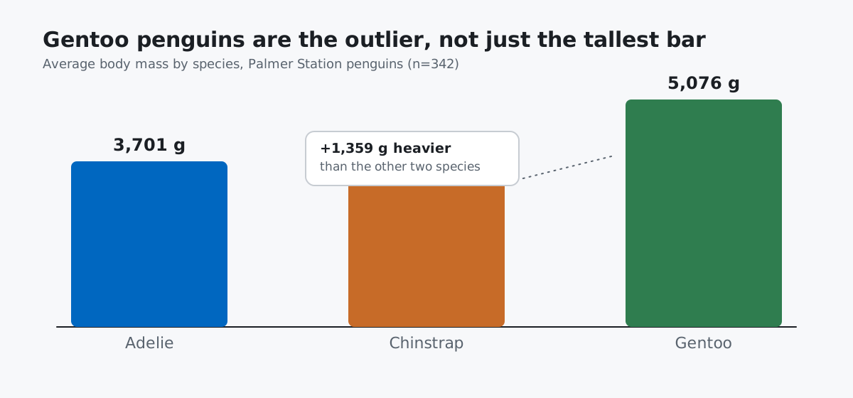
The chart’s honest job is answering “how much heavier is a Gentoo penguin?” — so say that directly, and put the actual number on the bar it belongs to instead of making the reader estimate it against an axis:
fig, ax = plt.subplots(figsize=(7, 4.5))
bars = ax.bar(means.index, means.values, color=colors, width=0.6)
for s in ax.spines:
    ax.spines[s].set_visible(s == "bottom")
ax.set_yticks([])
ax.set_title("Gentoo penguins are the outlier, not just the tallest bar",
             fontsize=12, fontweight="bold", loc="left")

for bar, species in zip(bars, means.index):
    height = bar.get_height()
    ax.annotate(f"{height:,.0f} g", (bar.get_x() + bar.get_width() / 2, height),
                xytext=(0, 6), textcoords="offset points", ha="center",
                fontsize=10, fontweight="bold")

diff = means["Gentoo"] - means[["Adelie", "Chinstrap"]].mean()
round(diff, 1)1359.1Each bar now carries its own exact value — 3,701 g, 3,733 g, 5,076 g — printed where the reader is already looking, so there’s no legend to cross-reference and no axis to squint at. The title states the finding instead of describing the chart type, and the callout does the arithmetic the reader would otherwise do themselves: Gentoo penguins average 1,359 g heavier than the mean of the other two species, more than a third heavier again. Nothing here needs a caption to be understood.
A chart that looks sharp in a Jupyter cell can still come out blurry the moment it leaves your notebook for a slide, a PDF, or a printed page — because “looks sharp on screen” and “has enough pixels for print” are two different things. savefig() needs to be told explicitly:
fig.savefig("body-mass-by-species.png", dpi=300, bbox_inches="tight", format="png")dpi=300 is the standard target for print-quality raster output (dots per inch); bbox_inches="tight" trims the excess whitespace matplotlib otherwise leaves around the figure, instead of you cropping it by hand. For this exact figure (figsize=(7, 4.5), tight-cropped), that produces a 2,070 × 1,318 pixel PNG at roughly 81 KB — compare that to dpi=100, which comes out 690 × 441 pixels at about 23 KB, noticeably softer once scaled up on a slide or a printed page. If the chart is going into a web page rather than print, format="svg" is usually the better call: a vector format stays crisp at any zoom with no DPI decision to make, which is exactly how this post’s own thumbnail and diagram images are built.
plt.style.use() changes matplotlib’s global defaults and doesn’t undo itself. Call it once, anywhere in a notebook or script, and every chart drawn afterward inherits the new look — including ones that have nothing to do with why you called it:
plt.style.use("default")
before = plt.rcParams["axes.facecolor"], plt.rcParams["axes.grid"]
plt.style.use("dark_background")
after = plt.rcParams["axes.facecolor"], plt.rcParams["axes.grid"]
before, after
(('white', False), ('black', False))That axes.facecolor change from 'white' to 'black' is still sitting in plt.rcParams for the next chart you draw, whether you meant it to be there or not — a common way notebooks end up with one inexplicably dark plot three cells later. If you only want a style for one chart, scope it instead:
with plt.style.context("dark_background"):
    inside = plt.rcParams["axes.facecolor"]
outside = plt.rcParams["axes.facecolor"]
inside, outside
('black', 'white')plt.style.context() applies the style only inside the with block and reverts automatically on exit — outside is back to 'white', no manual cleanup needed.
Color that doesn’t encode anything isn’t neutral — if it’s assigned by position instead of identity, it can flip meaning between renders. Picking colors by index into a color cycle, rather than mapping each category to its own fixed color, means the same species can get a different color depending on what order the data happens to be sorted in:
colors_by_position = [plt.cm.tab10(i) for i in range(3)]
asc = dict(zip(means.sort_values().index, colors_by_position))
desc = dict(zip(means.sort_values(ascending=False).index, colors_by_position))
asc["Gentoo"] == desc["Gentoo"]FalseSorted ascending, Gentoo lands last and gets the third cycle color; sorted descending, it lands first and gets the first color instead — the same species, two different colors, purely from row order. The palette section above already avoids this: map each category to a fixed color in a dictionary once, and every chart using that dictionary shows the same species in the same color, however the rows are sorted.
A legend that repeats a direct annotation is duplicated information, not extra clarity. Once every bar is labeled with its own species name, a legend box listing the same three names again isn’t adding anything:
legend_labels = ["Adelie", "Chinstrap", "Gentoo"]
annotation_labels = ["Adelie", "Chinstrap", "Gentoo"]
set(legend_labels) == set(annotation_labels)TrueDrop the legend and keep the direct labels — they sit closer to the data, so the reader’s eyes never leave the chart to decode it.
A savefig() call with no dpi argument defaults to the figure’s on-screen resolution, not a print-ready one. Matplotlib’s own default is 100 — perfectly fine for a quick look in a notebook, quietly wrong for anything meant to be enlarged:
fig2, ax2 = plt.subplots(figsize=(6, 4))
ax2.bar(means.index, means.values, color=colors)
fig2.savefig("default-dpi.png")  # no dpi kwarg
default: (600, 400) pixels
dpi=300: (2070, 1318) pixelsSame chart, same figsize, but roughly a sixth of the pixel area of the dpi=300 version from the saving section above. On a laptop screen you’d never notice; printed at full size or dropped into a PDF next to real print-resolution images, it visibly softens.
One chart, six deliberate decisions:
plt.style.use() — the fast global option for exploratory work; scope it with plt.style.context() if you don’t want it to outlive the one chart.dpi=300 and bbox_inches="tight" for raster output meant for print or slides; SVG when it just needs to stay crisp on the web.If you want to go further with matplotlib fundamentals — titles, labels, line styles, subplots, and grid layouts from the ground up — the Customizing Plots lessons in our free Python for Data Analytics course build on exactly the techniques in this post.
 Python
Build an AI Chatbot in Python: A Command-Line LLM Client
A from-scratch walkthrough of the pattern behind every LLM chatbot: one function that sends a message plus conversation history to a chat-completion API, a persona set by a system prompt, and a loop that keeps the conversation going.
Read tutorial
Python
Build an AI Chatbot in Python: A Command-Line LLM Client
A from-scratch walkthrough of the pattern behind every LLM chatbot: one function that sends a message plus conversation history to a chat-completion API, a persona set by a system prompt, and a loop that keeps the conversation going.
Read tutorial
 Software Engineering
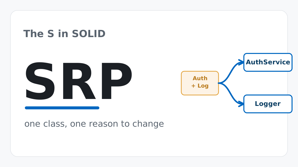
The Single Responsibility Principle: One Class, One Reason to Change
The Single Responsibility Principle says a class should have only one reason to change. See it in action: take a Python AuthService that also owns its logging, find why that's a problem, and refactor it into clean, focused classes.
Read tutorial
Software Engineering
The Single Responsibility Principle: One Class, One Reason to Change
The Single Responsibility Principle says a class should have only one reason to change. See it in action: take a Python AuthService that also owns its logging, find why that's a problem, and refactor it into clean, focused classes.
Read tutorial