Title here
Summary here
Use a fictional bike-share dataset to answer one focused question with pandas. Compare weekday and weekend trip duration, inspect the full distributions, and see how the trip-purpose mix changes the interpretation.

Exploratory data analysis often starts with a vague request: “Look at this file and find something interesting.” That request suggests many possible charts but gives you no clear stopping point. It is easier to make progress when you begin with one question that names the columns and groups you need to compare.
In this tutorial, you analyze data for a fictional bike-share service. The operations team asks: Are weekend trips longer than weekday trips? We will use pandas to turn that sentence into a sequence of checks. Then we will examine whether the kinds of trips taken on weekdays and weekends change how we should interpret the first answer.
This is exploratory data analysis (EDA): using summaries and visual checks to learn what a dataset supports before making a larger claim. The goal is not to inspect every column or produce every chart. It is to answer one useful question, notice what could mislead you, and state a conclusion that fits the evidence.
For a broader routine for meeting an unfamiliar table, see the step-by-step pandas EDA walkthrough. This lesson goes deeper on the reasoning behind one group comparison.
You need Python and basic experience running a script or notebook cell. You should know that a pandas DataFrame is a table with labeled rows and columns. You do not need prior statistics knowledge.
Create an isolated environment and install pandas and Matplotlib:
python -m venv .venv
source .venv/bin/activate
python -m pip install pandas matplotlib
On Windows PowerShell, activate the environment with .venv\Scripts\Activate.ps1.
The published output was executed with Python 3.13.2, pandas 3.0.3, NumPy 2.5.1, and Matplotlib 3.11.0. Download harborview_bike_trips.csv into your working folder.
Harborview and all 720 trips are fictional. The CSV was generated with a fixed random seed and is released under CC0-1.0, so you may copy and adapt it without restriction. The times, distances, trip purposes, and weather values do not describe a real place or person.
A focused EDA question has three parts:
Our question becomes a small analysis plan:
Question: Are weekend trips longer than weekday trips?
Metric:   duration_min
Groups:   Weekday and Weekend
Context:  purpose (Commute, Errand, or Leisure)
Unit:     one row = one completed trip
The unit of observation is what one row represents. It matters because 720 trip rows are not the same as 720 riders. One person may take several trips, so our results describe trips rather than people.
The context check also limits what we are allowed to say. If weekend trips are longer, the day type may not be the reason. The weekend group may contain a larger share of leisure trips, and leisure trips may be longer in this dataset. EDA can reveal this alternative explanation, but this table alone cannot prove what caused the difference.
First, load the CSV and ask pandas to parse started_at as a date and time. The pandas read_csv documentation describes the parse_dates argument used here.
import pandas as pd

trips = pd.read_csv(
    "harborview_bike_trips.csv",
    parse_dates=["started_at"],
)

print(trips.head(4).to_string(index=False))
print("\nshape:", trips.shape)
trip_id started_at member_type purpose distance_km duration_min rain_mm
HV-0319 2026-04-01 06:10:00 Member Commute 5.01 17.3 0.0
HV-0068 2026-04-01 07:50:00 Day pass Errand 2.54 15.5 0.0
HV-0241 2026-04-01 08:38:00 Member Errand 3.31 24.1 0.0
HV-0363 2026-04-01 08:48:00 Member Commute 6.59 30.2 0.0
shape: (720, 7)The preview supports our stated unit: each row has one trip_id, one start time, and one duration. It does not confirm that every ID is unique or every required value is present. Run those two guardrails before calculating a group summary:
print("duplicate trip IDs:", trips["trip_id"].duplicated().sum())
print("missing values:", int(trips.isna().sum().sum()))
duplicate trip IDs: 0
missing values: 0Zero duplicate IDs means no trip will be counted twice because its identifier was repeated. Zero missing cells means every column in this file is complete, including the grouping and duration columns. These checks do not prove that every value is correct. They only rule out two common sources of a misleading count. For reusable rules about identifiers, categories, types, and ranges, read the pandas data-quality report tutorial.
Now derive the comparison label from the timestamp. In pandas, Monday is day 0 and Sunday is day 6, so values below 5 are weekdays.
trips["day_type"] = trips["started_at"].dt.dayofweek.map(
    lambda day_number: "Weekday" if day_number < 5 else "Weekend"
)

print(trips["day_type"].value_counts().to_string())
day_type
Weekday 490
Weekend 230The groups are not the same size. That is not an error, but it is a reason to keep the ride counts beside every summary. Readers should be able to see that one median summarizes 490 rides and the other summarizes 230.
A single average hides the shape of a group. We will calculate five values for each day type:
rides: the number of trip rowsmedian_minutes: the middle duration after sortingmean_minutes: the arithmetic averageq1_minutes: the 25th percentileq3_minutes: the 75th percentileThe interval from the first quartile (Q1) to the third quartile (Q3) contains the middle half of the observed durations. It places the median in context and is less sensitive to the longest few rides than the full range.
Define two small functions for the quartiles, then use named aggregation. With pandas named aggregation, each keyword sets an output column and each tuple selects an input column plus a summary operation. This syntax is documented in the official pandas GroupBy guide.
def q1(values):
    return values.quantile(0.25)


def q3(values):
    return values.quantile(0.75)


duration_summary = (
    trips.groupby("day_type")
    .agg(
        rides=("trip_id", "size"),
        median_minutes=("duration_min", "median"),
        mean_minutes=("duration_min", "mean"),
        q1_minutes=("duration_min", q1),
        q3_minutes=("duration_min", q3),
    )
    .reindex(["Weekday", "Weekend"])
    .round(1)
)

print(duration_summary.to_string())
rides median_minutes mean_minutes q1_minutes q3_minutes
day_type
Weekday 490 20.3 22.5 16.5 25.8
Weekend 230 30.1 31.9 22.0 41.5The direct answer is clear: the weekend median is 30.1 minutes, compared with 20.3 minutes on weekdays. The middle half of weekend trips spans 22.0 to 41.5 minutes, which is both higher and wider than the weekday interval of 16.5 to 25.8 minutes.
The mean is above the median in both groups. This pattern suggests a longer upper tail: a relatively small number of long trips pull the mean upward. We should look at the distributions before treating either measure of the center as a complete description.
A box plot summarizes a numeric distribution. The line inside each box is the median, and the lower and upper edges show Q1 and Q3. With Matplotlib’s default rule, each whisker extends to the most distant observed value within 1.5 times the interquartile range from the box. Values beyond the whiskers appear as separate points. The interquartile range is the distance from Q1 to Q3.
The next code selects Matplotlib’s non-interactive Agg backend before importing pyplot. This lets the script save a file without opening a desktop window. Matplotlib lists Agg among its non-interactive backends.
import matplotlib

matplotlib.use("Agg")

import matplotlib.pyplot as plt

plt.rcParams.update(
    {
        "font.size": 11,
        "axes.titlesize": 15,
        "axes.labelsize": 11,
        "figure.facecolor": "white",
        "axes.facecolor": "white",
    }
)

plot_values = [
    trips.loc[trips["day_type"] == label, "duration_min"]
    for label in ["Weekday", "Weekend"]
]

fig, ax = plt.subplots(figsize=(7.4, 4.5))
box = ax.boxplot(
    plot_values,
    tick_labels=["Weekday", "Weekend"],
    patch_artist=True,
    widths=0.55,
    medianprops={"color": "#1b1f24", "linewidth": 2.2},
    boxprops={"edgecolor": "#59636e", "linewidth": 1.5},
    whiskerprops={"color": "#59636e", "linewidth": 1.3},
    capprops={"color": "#59636e", "linewidth": 1.3},
    flierprops={
        "marker": "o",
        "markerfacecolor": "#d67b28",
        "markeredgecolor": "none",
        "markersize": 4,
        "alpha": 0.65,
    },
)
for patch, color in zip(box["boxes"], ["#dcebf7", "#fde4cc"]):
    patch.set_facecolor(color)

ax.set_title(
    "Weekend rides have a higher median and a wider upper range",
    loc="left",
)
ax.set_ylabel("Trip duration (minutes)")
ax.grid(axis="y", color="#e3e6ea", linewidth=0.8)
ax.spines[["top", "right", "left"]].set_visible(False)
ax.tick_params(axis="y", length=0)
fig.tight_layout()
fig.savefig("question-driven-eda-pandas-duration.svg")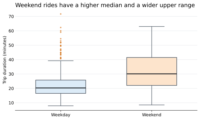
The higher weekend median is visible inside the box, not only in one distant ride or in the mean. The weekend box is also taller and higher, so its middle half covers a wider and generally longer range. Several points lie beyond the whiskers. Such a point is not automatically bad data; it is a prompt to inspect the corresponding row.
Use nlargest() to bring the five longest durations back to their trip IDs and related fields:
longest = trips.nlargest(5, "duration_min")[
    ["trip_id", "day_type", "purpose", "distance_km", "duration_min"]
]
print(longest.to_string(index=False))
trip_id day_type purpose distance_km duration_min
HV-0111 Weekday Leisure 14.08 71.7
HV-0090 Weekend Leisure 11.62 63.0
HV-0521 Weekend Leisure 12.54 63.0
HV-0425 Weekend Leisure 12.99 62.5
HV-0712 Weekday Leisure 11.52 62.3All five are leisure rides longer than 11 kilometers. That combination is plausible within this fictional dataset, so there is no evidence that these rows should be deleted. More importantly, purpose now looks relevant to the original comparison.
The weekend and weekday groups may contain different kinds of trips. A cross-tabulation counts combinations of categories. With normalize="index", each day-type row becomes percentages that add to 100.
purpose_mix = (
    pd.crosstab(
        trips["day_type"],
        trips["purpose"],
        normalize="index",
    )
    .mul(100)
    .reindex(
        index=["Weekday", "Weekend"],
        columns=["Commute", "Errand", "Leisure"],
    )
    .round(1)
)

print(purpose_mix.to_string())
purpose Commute Errand Leisure
day_type
Weekday 64.1 26.5 9.4
Weekend 17.4 27.0 55.7Weekday trips are 64.1% commutes, while weekend trips are 55.7% leisure rides. Errands hold a similar share in both groups. The composition changed sharply, and the longest-row check already showed that leisure trips can be long.
Plotting those percentages as one stacked bar per day type makes the change in composition easier to see. The loop writes a rounded percentage inside each segment that is wide enough to label clearly:
fig, ax = plt.subplots(figsize=(7.4, 4.5))
purpose_mix.plot(
    kind="barh",
    stacked=True,
    ax=ax,
    color=["#0067c0", "#d67b28", "#57a773"],
    width=0.58,
)
for row_index, (_, row) in enumerate(purpose_mix.iterrows()):
    left = 0.0
    for value in row:
        if value >= 8:
            ax.text(
                left + value / 2,
                row_index,
                f"{value:.0f}%",
                ha="center",
                va="center",
                color="white" if value > 18 else "#1b1f24",
                fontsize=10,
                fontweight="bold",
            )
        left += value

ax.set_title("The trip-purpose mix changes on weekends", loc="left")
ax.set_xlabel("Share of rides")
ax.set_ylabel("")
ax.set_xlim(0, 100)
ax.set_xticks([0, 25, 50, 75, 100], ["0%", "25%", "50%", "75%", "100%"])
ax.legend(
    ncol=3,
    frameon=False,
    loc="lower center",
    bbox_to_anchor=(0.5, -0.28),
)
ax.spines[["top", "right", "left"]].set_visible(False)
ax.tick_params(axis="y", length=0)
fig.tight_layout()
fig.savefig("question-driven-eda-pandas-purpose-mix.svg")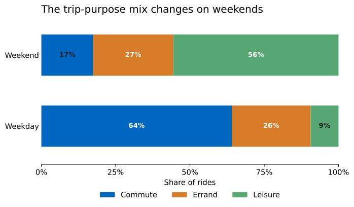
One final calculation compares weekday and weekend medians within each recorded purpose. Separating the trips this way shows whether a similar day-type gap remains among trips with the same purpose label.
median_by_purpose = (
    trips.groupby(["purpose", "day_type"])["duration_min"]
    .median()
    .unstack()
    .reindex(
        index=["Commute", "Errand", "Leisure"],
        columns=["Weekday", "Weekend"],
    )
    .round(1)
)
median_by_purpose["difference"] = (
    median_by_purpose["Weekend"] - median_by_purpose["Weekday"]
).round(1)

print(median_by_purpose.to_string())
day_type Weekday Weekend difference
purpose
Commute 18.5 18.7 0.2
Errand 22.8 22.6 -0.2
Leisure 41.4 40.3 -1.1The overall gap was 9.8 minutes. Within each purpose, the weekend-minus-weekday difference ranges from −1.1 to +0.2 minutes. This result is consistent with the overall gap coming mainly from the different mix of trip purposes, not from a large weekend shift within any recorded purpose.
This comparison does not prove that purpose causes duration. Distance, route, rider behavior, weather, and repeated trips by the same rider could still matter. The supported conclusion is narrower: weekend trips are longer in this dataset, the purpose mix differs sharply by day type, and the day-type gap is small when trips are compared within each recorded purpose.
More charts do not guarantee more understanding. Write the question, metric, groups, unit, and one context field first. Add a chart only when it answers part of that plan.
Two medians can look equally reliable even when one comes from 500 rows and the other from 5. Keep rides in the same summary table. Small groups deserve more caution and may need more data.
A point beyond the whisker is unusual under the plot’s rule, not automatically invalid. Trace it back to its row. Check related fields and domain limits before changing or deleting anything.
This analysis is descriptive, even though the data is synthetic. We grouped trip rows; we did not assign otherwise identical trips to weekday and weekend conditions. Say that weekend trips “were longer in this dataset” or that day type “was associated with” duration. An association means that two patterns appear together; it does not establish cause.
The weekday and weekend groups contain different proportions of commute, errand, and leisure trips. An overall average or median combines those purposes. Compare relevant subgroups before attributing the total gap to the day-type label.
.dt.dayofweek starts at zeroPandas uses Monday 0 through Sunday 6. The condition < 5 selects Monday through Friday. If you use a different business calendar, define it explicitly instead of assuming Saturday and Sunday are the only non-working days.
KeyError: 'started_at' or losing date methodsCheck the CSV header for spelling and spaces. If .dt reports that it can only work with date-like values, reload with parse_dates=["started_at"] or convert the column with pd.to_datetime() before deriving day_type.
Question-driven EDA is a short reasoning loop:
In the bike-share example, weekend trips had a 30.1-minute median versus 20.3 minutes on weekdays. That was a clear descriptive pattern in the generated data. The deeper check showed that leisure rides formed a much larger share of weekend trips. When we compared weekday and weekend medians within the same purpose, the differences were small.
That is the durable lesson: the first group summary is an answer, but it is also an invitation to ask what the groups contain. A careful EDA workflow does both before it stops.
 Python
Build an AI Chatbot in Python: A Command-Line LLM Client
A from-scratch walkthrough of the pattern behind every LLM chatbot: one function that sends a message plus conversation history to a chat-completion API, a persona set by a system prompt, and a loop that keeps the conversation going.
Read tutorial
Python
Build an AI Chatbot in Python: A Command-Line LLM Client
A from-scratch walkthrough of the pattern behind every LLM chatbot: one function that sends a message plus conversation history to a chat-completion API, a persona set by a system prompt, and a loop that keeps the conversation going.
Read tutorial
 Software Engineering
The Single Responsibility Principle: One Class, One Reason to Change
The Single Responsibility Principle says a class should have only one reason to change. See it in action: take a Python AuthService that also owns its logging, find why that's a problem, and refactor it into clean, focused classes.
Read tutorial
Software Engineering
The Single Responsibility Principle: One Class, One Reason to Change
The Single Responsibility Principle says a class should have only one reason to change. See it in action: take a Python AuthService that also owns its logging, find why that's a problem, and refactor it into clean, focused classes.
Read tutorial