Title here
Summary here
A plain average can give every subgroup the same importance even when their sizes differ. Build a weighted-rate workflow in pandas, check it from counts, and standardize three teams to the same workload mix.

Suppose three support teams report the percentage of requests they resolve on the same day. North reports 87.0%, East reports 77.5%, and South reports 79.0%. It looks as if North is clearly ahead.
But the teams did not receive the same kinds of requests. Password resets are often quicker than device setup. North received many password resets, while East received many device-setup requests. The overall percentages mix together two things: how each team performed and which work arrived.
This tutorial shows how to separate those ideas with pandas. You will calculate a weighted average, an average in which larger groups have more influence than smaller groups. Then you will give every team the same request-type mix, so the comparison answers a more focused question: how would their rates differ if their workloads had the same shape?
This is not a general exploratory data analysis walkthrough. It is a practical method for one common problem: comparing rates when subgroup sizes differ. If you first need a routine for inspecting an unfamiliar table, start with our pandas EDA walkthrough.
Keep three different objects separate. A count says how many events occurred, such as 114 tickets resolved. A rate divides that count by its opportunity total, such as 114 out of 120, or 95%. A weight says how much influence that rate receives when several rates are combined.
Imagine three containers with different numbers of tickets. Taking a plain mean of their rates treats every container as the same size. A weighted mean accounts for how many tickets each container holds. If the goal is to report what actually happened, use each container’s real size. If the goal is to compare teams under the same conditions, give every team the same set of container sizes. The code below implements both views and keeps them side by side.
You need Python 3.10 or later and basic familiarity with running a Python file or notebook cell. A DataFrame is pandas’ table-like object with rows and named columns. We will create one from a small CSV, add columns, group rows, and merge two tables.
Create a virtual environment if you want an isolated project, then install the two packages used here. On macOS or Linux, run:
python -m venv .venv
source .venv/bin/activate
python -m pip install pandas matplotlib
On Windows PowerShell, replace the activation command with .venv\Scripts\Activate.ps1.
The published results were tested with Python 3.13.2, pandas 3.0.3, and Matplotlib 3.11.0. The pandas operations also use stable APIs available in pandas 2.x.
Download the tutorial’s help-desk summary CSV into your working folder. It is an original synthetic dataset: all teams, counts, and outcomes are fictional. It is released under CC0-1.0, so you can reuse it without restriction.
Now load pandas and read the file:
import pandas as pd

tickets = pd.read_csv("help_desk_summary.csv")
tickets.head(4)
team request_type tickets_received tickets_resolved_same_day
0 North Password reset 120 114
1 North Account access 60 48
2 North Device setup 20 12
3 East Password reset 40 37Each row represents one team and one request type. The table stores counts, not individual requests. tickets_received is the denominator, or total number of opportunities. tickets_resolved_same_day is the numerator, or number of successful outcomes.
A rate is a part divided by its total. Before grouping anything, calculate the same-day resolution rate for every row:
tickets["same_day_rate"] = (
    tickets["tickets_resolved_same_day"]
    / tickets["tickets_received"]
)

tickets[["team", "request_type", "tickets_received", "same_day_rate"]]
team request_type tickets_received same_day_rate
0 North Password reset 120 0.950
1 North Account access 60 0.800
2 North Device setup 20 0.600
3 East Password reset 40 0.925
4 East Account access 80 0.825
5 East Device setup 80 0.650
6 South Password reset 70 0.900
7 South Account access 70 0.800
8 South Device setup 60 0.650Python stores 95% as 0.95. Multiplying by 100 changes its display to 95 but does not change the underlying idea. Keeping rates between 0 and 1 makes later multiplication easier.
The small table reveals an important pattern. North has the best password-reset rate and ties South on account access, but it has the lowest device-setup rate. East handles device setup better than North. A single overall number will hide those details, so keep the subgroup table available while you summarize it.
It is tempting to group by team and take the mean of same_day_rate:
plain_mean = (
    tickets.groupby("team")["same_day_rate"]
    .mean()
    .sort_values(ascending=False)
)
plain_mean
team
East 0.800000
North 0.783333
South 0.783333
Name: same_day_rate, dtype: float64This calculation gives each request type one-third of the team’s result. For North, the 20 device-setup tickets receive the same influence as the 120 password resets. That answers “what is the mean of the three subgroup rates?” It does not answer “what share of all tickets were resolved on the same day?”
For the overall rate, add the numerators, add the denominators, and divide the two totals. We will also retain the plain mean so the difference remains visible. pandas calls this named aggregation: each keyword becomes an output column, and its tuple says which input column and summary function to use. The current pandas GroupBy documentation describes this syntax.
team_summary = (
    tickets.groupby("team", as_index=False)
    .agg(
        tickets_received=("tickets_received", "sum"),
        tickets_resolved_same_day=("tickets_resolved_same_day", "sum"),
        unweighted_rate=("same_day_rate", "mean"),
    )
)

team_summary["actual_rate"] = (
    team_summary["tickets_resolved_same_day"]
    / team_summary["tickets_received"]
)

team_summary
team tickets_received tickets_resolved_same_day unweighted_rate actual_rate
0 East 200 155 0.800000 0.775
1 North 200 174 0.783333 0.870
2 South 200 158 0.783333 0.790North resolved 174 of 200 tickets on the same day, so its actual rate is 174 / 200 = 0.87. The same result can be written as a weighted average of its subgroup rates:
(0.95 × 120 + 0.80 × 60 + 0.60 × 20) / 200 = 0.87The weights are the subgroup sizes. A subgroup with 120 tickets should affect the overall rate six times as much as a subgroup with 20 tickets. Adding the successes and totals directly is the safest method when you have both counts.
The actual rate is correct for the work each team really received. It is useful for staffing and service reporting. It is not a clean performance comparison because the workload mixes differ.
To create an apples-to-apples comparison, first calculate one shared weight for each request type. We will use the mix across the entire dataset. All teams handled 600 tickets together: 230 password resets, 210 account-access requests, and 160 device setups.
workload_mix = (
    tickets.groupby("request_type")["tickets_received"].sum()
    / tickets["tickets_received"].sum()
)
workload_mix
request_type
Account access 0.350000
Device setup 0.266667
Password reset 0.383333
Name: tickets_received, dtype: float64Read these as 35.0%, 26.7%, and 38.3% of the shared workload. They sum to 1, apart from any small floating-point display difference:
workload_mix.sum()1.0Next, attach those weights to every matching request-type row. merge() is pandas’ database-style join. The validate="many_to_one" argument checks our assumption: many team rows may share one request type, but the weight table must contain each request type once. The official pandas.merge reference lists the available validation patterns.
comparison = tickets.merge(
    workload_mix.rename("shared_weight"),
    on="request_type",
    validate="many_to_one",
)

comparison[["team", "request_type", "same_day_rate", "shared_weight"]].head(3)
team request_type same_day_rate shared_weight
0 North Password reset 0.95 0.383333
1 East Password reset 0.925 0.383333
2 South Password reset 0.90 0.383333The row order changes because the merge groups matching keys together. That is fine; our later calculation groups by team explicitly. Never depend on a merge preserving an incidental row order.
A standardized rate applies the same weights to every team’s subgroup rates. “Standardized” here means adjusted to a common distribution. It does not mean correct for every possible decision. Our reference is the combined workload, and that choice must be stated whenever the result is shared.
Multiply each subgroup rate by its shared weight, then add the weighted parts within each team:
comparison["weighted_part"] = (
    comparison["same_day_rate"] * comparison["shared_weight"]
)

standardized = (
    comparison.groupby("team", as_index=False)
    .agg(standardized_rate=("weighted_part", "sum"))
)

final = team_summary.merge(
    standardized,
    on="team",
    validate="one_to_one",
)

final[["team", "actual_rate", "unweighted_rate", "standardized_rate"]]
team actual_rate unweighted_rate standardized_rate
0 East 0.775 0.800000 0.816667
1 North 0.870 0.783333 0.804167
2 South 0.790 0.783333 0.798333The conclusion changes. North’s actual rate is highest at 87.0%, partly because 60% of its tickets were password resets, the request type with the highest resolution rate for every team. Under the shared mix, North’s rate is 80.4%. East rises from an actual 77.5% to a standardized 81.7%, the highest standardized result. South changes only slightly, from 79.0% to 79.8%, because its request mix was already close to the combined mix.
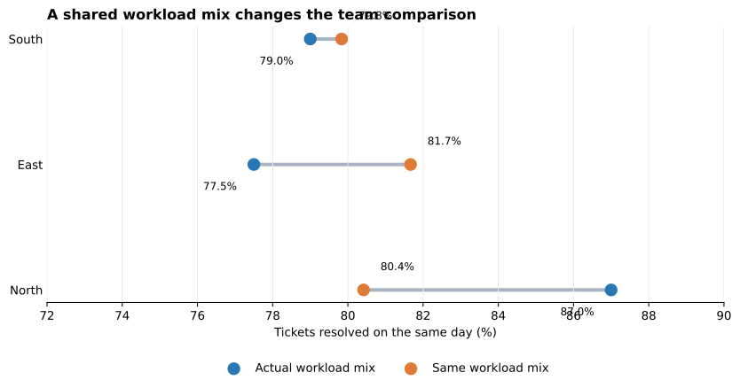
The blue dots answer what happened with each team’s real workload. The orange dots answer the comparison question under one shared workload. Neither set replaces the other. Use the actual rate for operational totals; use the standardized rate when you need to reduce the effect of differing request mixes.
Small checks prevent plausible-looking mistakes. First, no team and request-type pair should appear twice in this aggregate table:
assert not tickets.duplicated(["team", "request_type"]).any()Second, each denominator must be positive. Successful outcomes cannot exceed received tickets, and no success count should be negative:
assert tickets["tickets_received"].gt(0).all()
assert tickets["tickets_resolved_same_day"].between(
    0, tickets["tickets_received"]
).all()
Third, the shared weights must sum to 1. Use a tolerance because decimal fractions such as one-third cannot be represented exactly in binary floating-point:
assert abs(workload_mix.sum() - 1) < 1e-12Finally, every team must have every request type used by the reference mix. Otherwise a team would be missing one weighted part and its standardized rate would be too low:
expected_rows = tickets["team"].nunique() * tickets["request_type"].nunique()
assert len(tickets) == expected_rows
That last check fits this complete teaching dataset. In a real dataset, a missing combination might mean zero tickets rather than missing data. Decide which meaning applies before filling it.
The mean of 90% from 10 cases and 60% from 1,000 cases is not a meaningful overall success rate. Keep the counts that produced every percentage. If you only have percentages and no subgroup sizes, you cannot reconstruct the true overall rate.
The actual rate uses each team’s own subgroup counts. A standardized comparison uses one explicit set of weights for every team. Name the reference population or period. Different reasonable reference mixes can produce different standardized values.
If a CSV stores 95% as 95 instead of 0.95, divide by 100 before multiplying by weights. Check the range:
assert tickets["same_day_rate"].between(0, 1).all()groupby() and merge() can still return tidy output when a team is absent from one request type. The output may therefore look complete while using incomplete weights. Compare the observed combinations with the combinations you expect, or create a complete grid and decide whether gaps mean zero or unknown.
The adjusted result controls only for the request types in this table. It does not prove that team practices caused the difference. Shift times, staffing levels, request severity, and data quality may still differ. Standardization creates a clearer descriptive comparison, not a controlled experiment.
A weighted average gives each subgroup influence in proportion to a chosen weight. When you have success and total counts, calculate an actual overall rate by summing successes and dividing by summed totals. Do not take an unweighted mean of subgroup percentages unless equal subgroup importance is truly the question.
For a fairer group comparison, choose one shared mix, attach those weights to every group’s subgroup rates, multiply, and sum. State the reference mix and keep the actual rates beside the standardized rates because they answer different questions.
The durable workflow is short: inspect subgroup counts, calculate rates, preserve denominators, choose and validate weights, compare both views, and limit the conclusion to what the adjustment actually covers. Once you are comfortable with this pattern, the deeper pandas GroupBy tutorial will help you build more multi-metric summaries with the same split-and-aggregate idea.
 Python
Build an AI Chatbot in Python: A Command-Line LLM Client
A from-scratch walkthrough of the pattern behind every LLM chatbot: one function that sends a message plus conversation history to a chat-completion API, a persona set by a system prompt, and a loop that keeps the conversation going.
Read tutorial
Python
Build an AI Chatbot in Python: A Command-Line LLM Client
A from-scratch walkthrough of the pattern behind every LLM chatbot: one function that sends a message plus conversation history to a chat-completion API, a persona set by a system prompt, and a loop that keeps the conversation going.
Read tutorial
 Software Engineering
The Single Responsibility Principle: One Class, One Reason to Change
The Single Responsibility Principle says a class should have only one reason to change. See it in action: take a Python AuthService that also owns its logging, find why that's a problem, and refactor it into clean, focused classes.
Read tutorial
Software Engineering
The Single Responsibility Principle: One Class, One Reason to Change
The Single Responsibility Principle says a class should have only one reason to change. See it in action: take a Python AuthService that also owns its logging, find why that's a problem, and refactor it into clean, focused classes.
Read tutorial